Generative AI for Designers
12.19.2023
Sam Reed
How designers can use AI to visualize concepts, generate ideas, and improve their workflow.
In this article, we’ll cover the basics: how to use Midjourney and some ways it could be helpful in your work. But whatever tool you use, the same basic principles apply when using generative AI.
In preparation for that, I have a few thoughts on the ethics of AI and where it's going.
In 2022, I tried out a few different AI image generators. Although it was fun, I wasn’t particularly impressed with any of the results. Satisfied that AI would take years to replace or change my workflow—I set it to one side.
It hasn’t taken nearly that long to improve by leaps and bounds. I decided to dive in and figure out how these tools worked and the practical applications for my work.
Many questions still need answering regarding the ethics of AI and future regulation. How do we prevent bias? How do we preserve the rights and ownership of artists? Is it ethical for companies to train AI on other artists' work? How do we prevent people from using AI to spread misinformation, deepfake imagery, and video?
These are questions we should continue to discuss so we can find ways to use AI that respect the rights of artists and creators.
Now, let’s look at how to put it to work for you.
The Basics
I will share the basic principles for generating AI imagery in this guide. I will not explain how to set up Midjourney inside Discord. You can find technical details on getting started with Midjourney here.
Basic prompts
A basic prompt can be as simple as a single word, phrase or emoji.— Midjourney Quick Start Guide

Advanced Prompts
Advanced prompts combine different inputs, including image reference (in the form of a URL), text, and parameters. More on these later.

Basic prompt structure
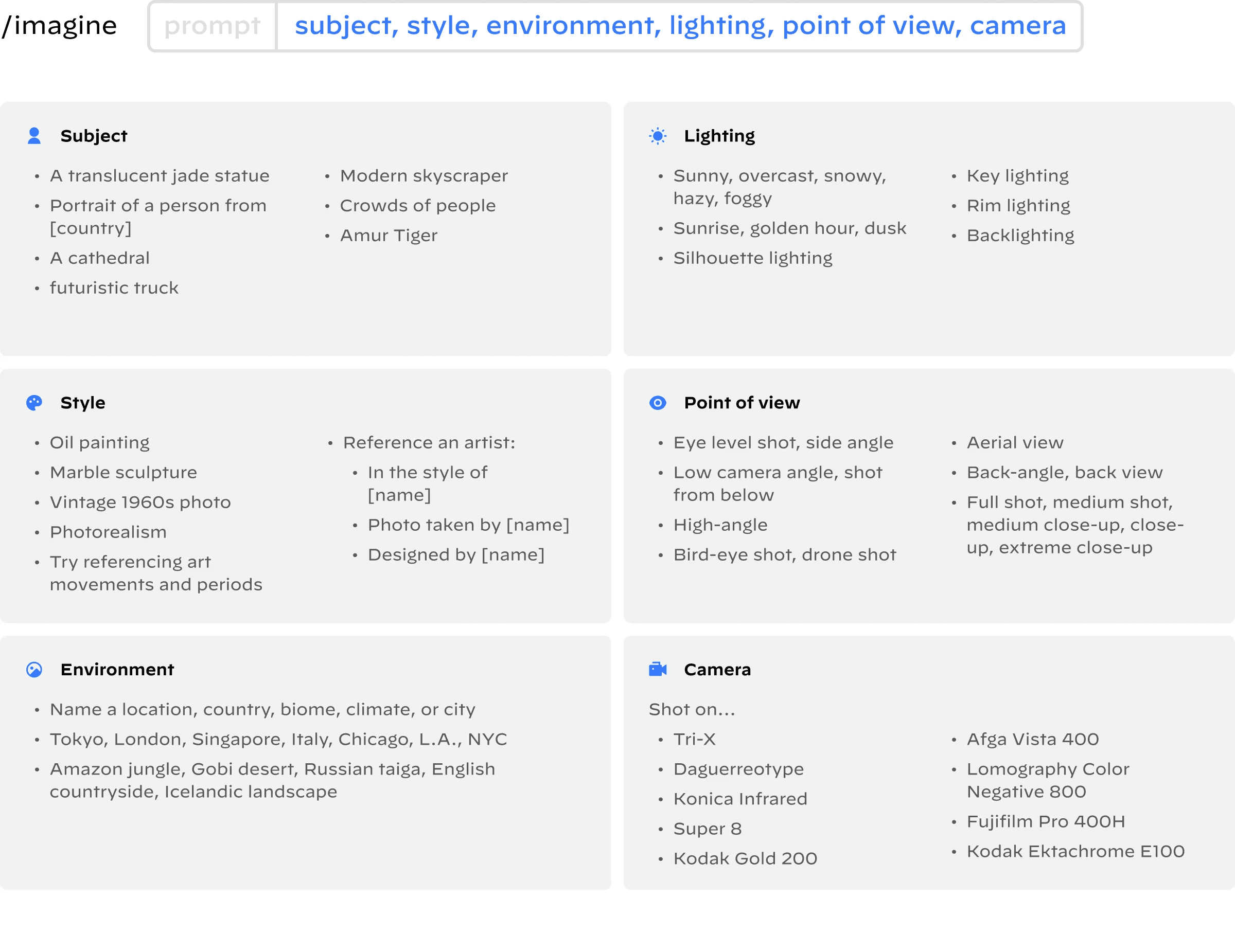
When writing a prompt, I consider the subject, style, environment, lighting, point of view, and camera type.
While Midjourney does not recognize grammar or punctuation, I find it helpful to separate parts of my prompt with commas to organize my thoughts.
View the examples below to get ideas for your prompts.
Basic prompt example
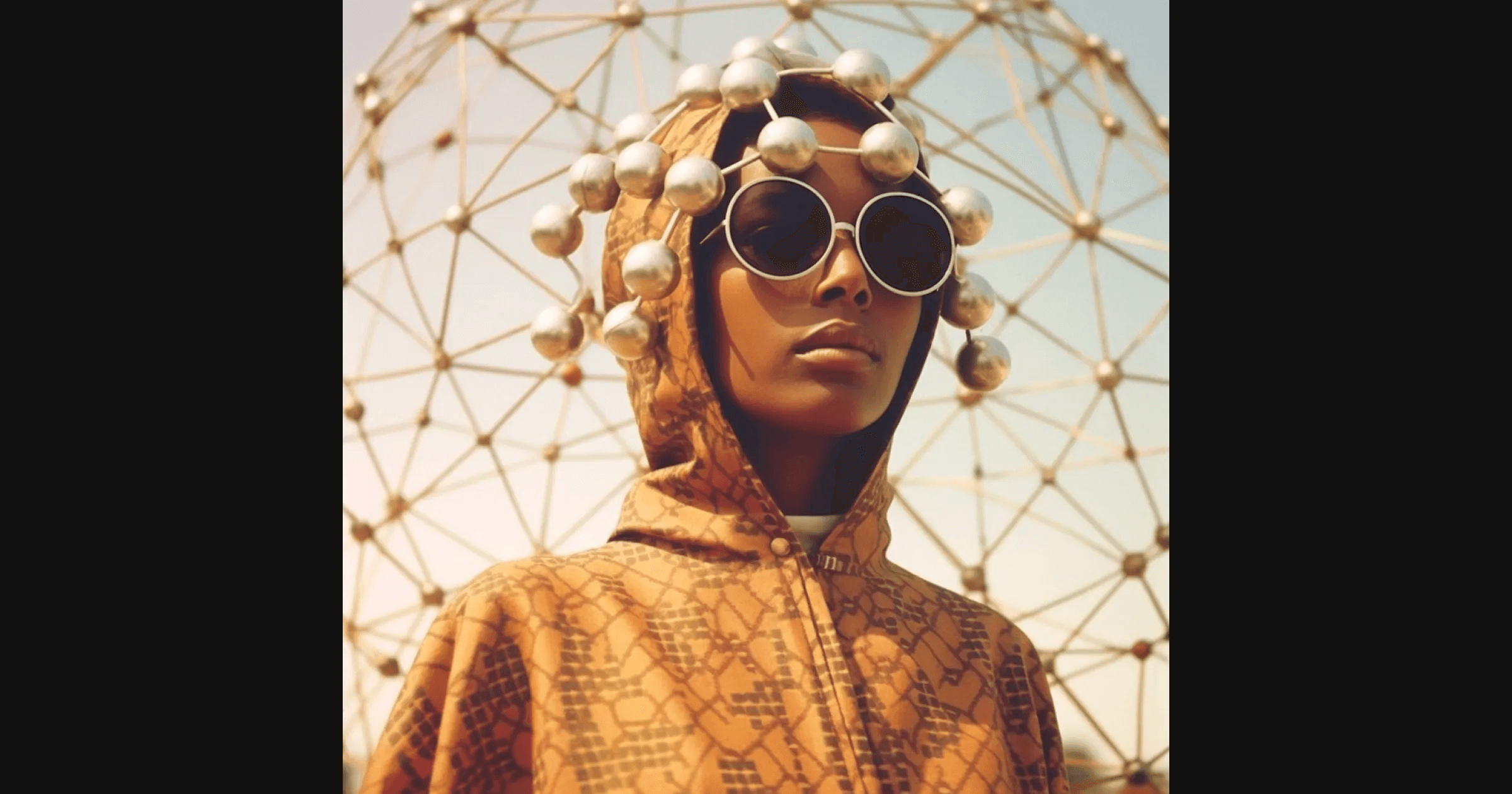
Prompt text: portrait of woman from Somalia, wearing clothing designed by buckminster fuller, full shot, vintage 1960s photo
How to use image reference in prompts
Referencing an image in your prompt
Using reference images in your prompts can be a shortcut to getting the look or feel you want without the image becoming over-stylized.
Image reference example 1
For this one, I chose an image from the MET collection. I’ll show you how starting with a reference image can save time and energy trying to get a specific look.
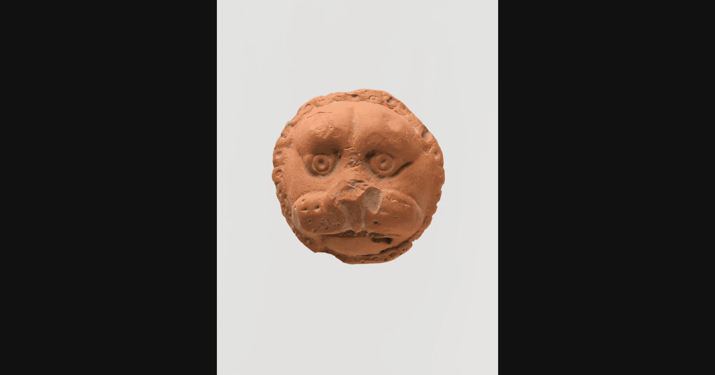
Lion Mask, Central Asia, early 12th century, MET Public Domain Images
I pasted the reference image link in each of the three prompts I wrote and tried changing one word in each prompt to see how it would affect the results. Changing one word at a time gives you a better idea of how it influences the AI’s output.
Image reference prompts
*Prompt differences in bold text.
[source image link], chinese style terracotta snarling lion mask, minimalist, damaged, plain white background, soft light, 1960s photo
[source image link], roman style terracotta snarling lion mask, minimalist, damaged, plain white background, soft light, 1960s photo
[source image link], medieval style terracotta snarling lion mask, minimalist, damaged, plain white background, soft light, 1960s photo
Image reference results
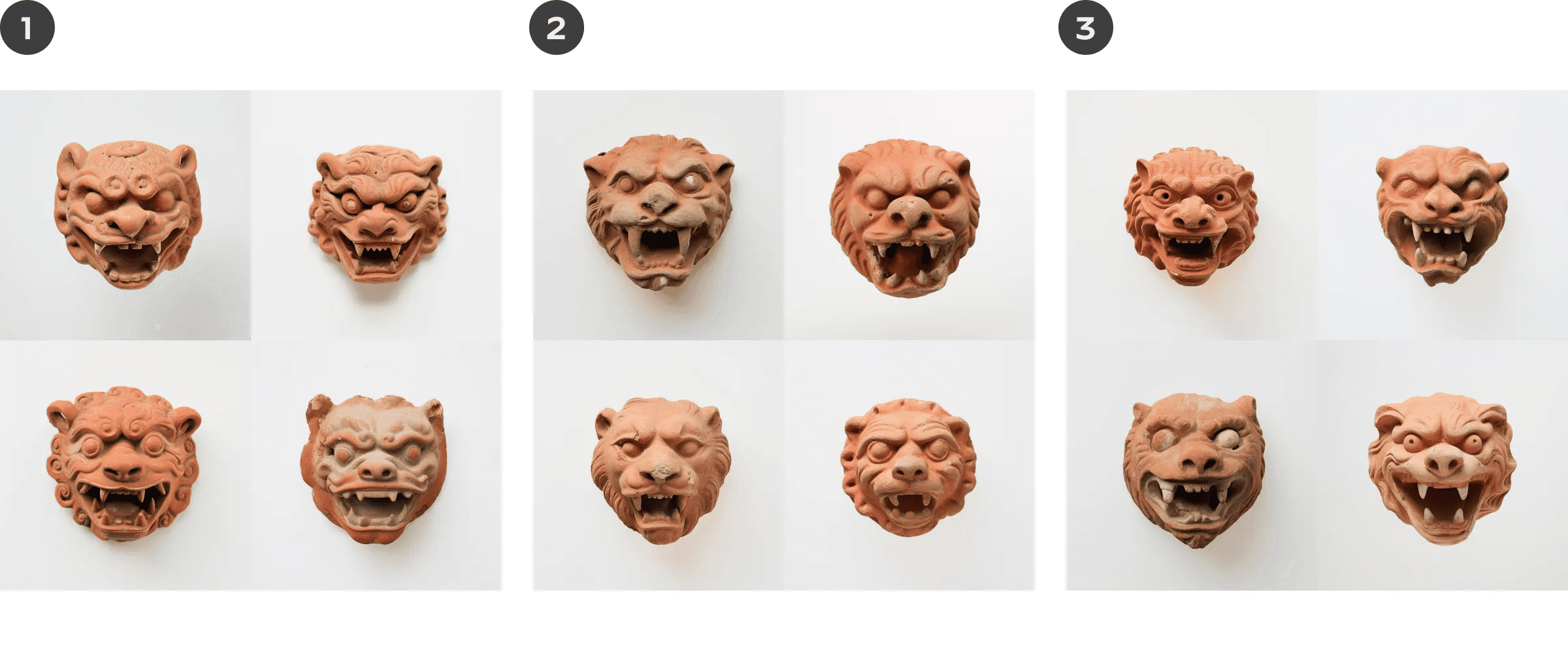
The influence of the image we referenced is apparent. It’s brought in a lot of material and stylistic details we might not have gotten otherwise. We can spot subtle differences between these results based on the keyword change in the prompt.
Midjourney always gives you a grid of four images for each prompt. You can then upscale the ones you like.
What would the result have looked like without an image reference?
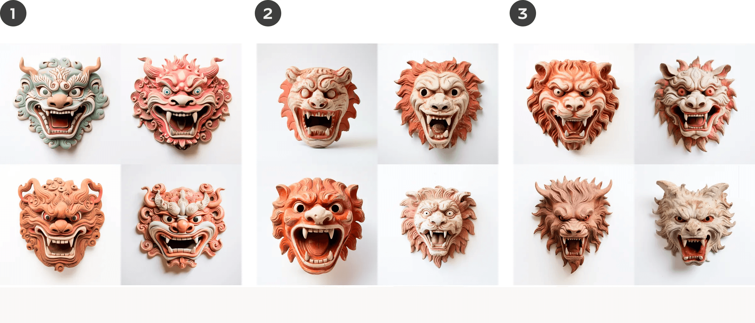
Without an image reference, the result defaults to Midjourney’s hyper-stylized aesthetic. Using a reference image is about degrees of control. It can help you push and pull the result across a spectrum of complexity and simplicity to tune in to your preferred style.
What if we want to take our results further?
We can push the stylization further using an image from the last round of prompts. Multiple rounds of this can give you something very different from your starting image.
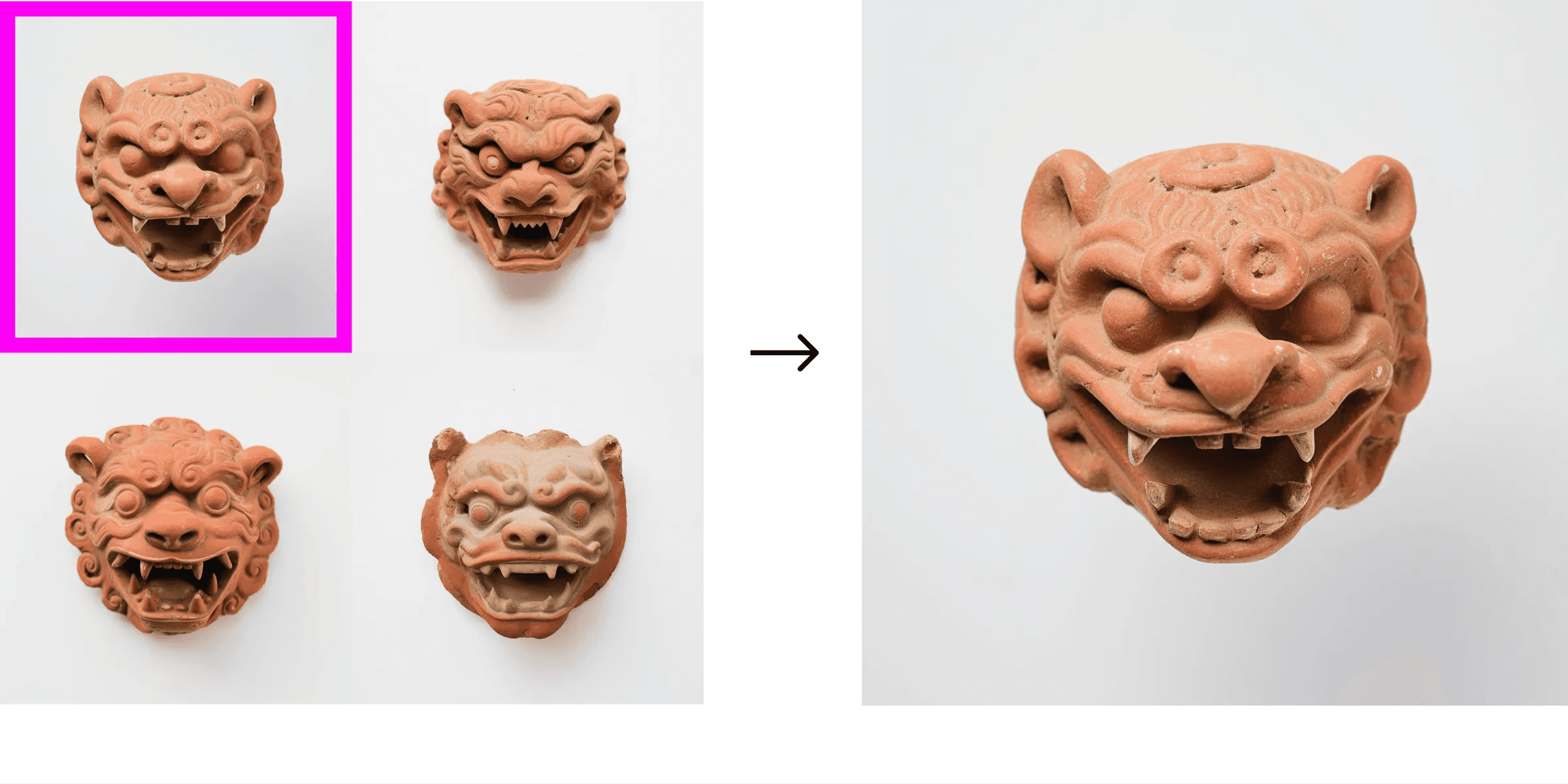
I liked this image in the top left of one of the grids, so we’ll use it as a reference in the following prompts.
Image reference round 2 prompts
*Prompt differences in bold text.
[source image link], Chinese style terracotta lion mask, damaged, plain white background, soft light, 1960s photo
[source image link] Chinese style terracotta lion mask, minimalist, damaged, plain white background, soft light, 1960s photo
[source image link] Chinese style terracotta lion mask, neolithic, damaged, plain white background, soft light, red and orange, 1960s photo
Image reference round 2 results
The results of round 2 show more detail and stylization, and there are subtle changes based on keywords we changed in our prompts.
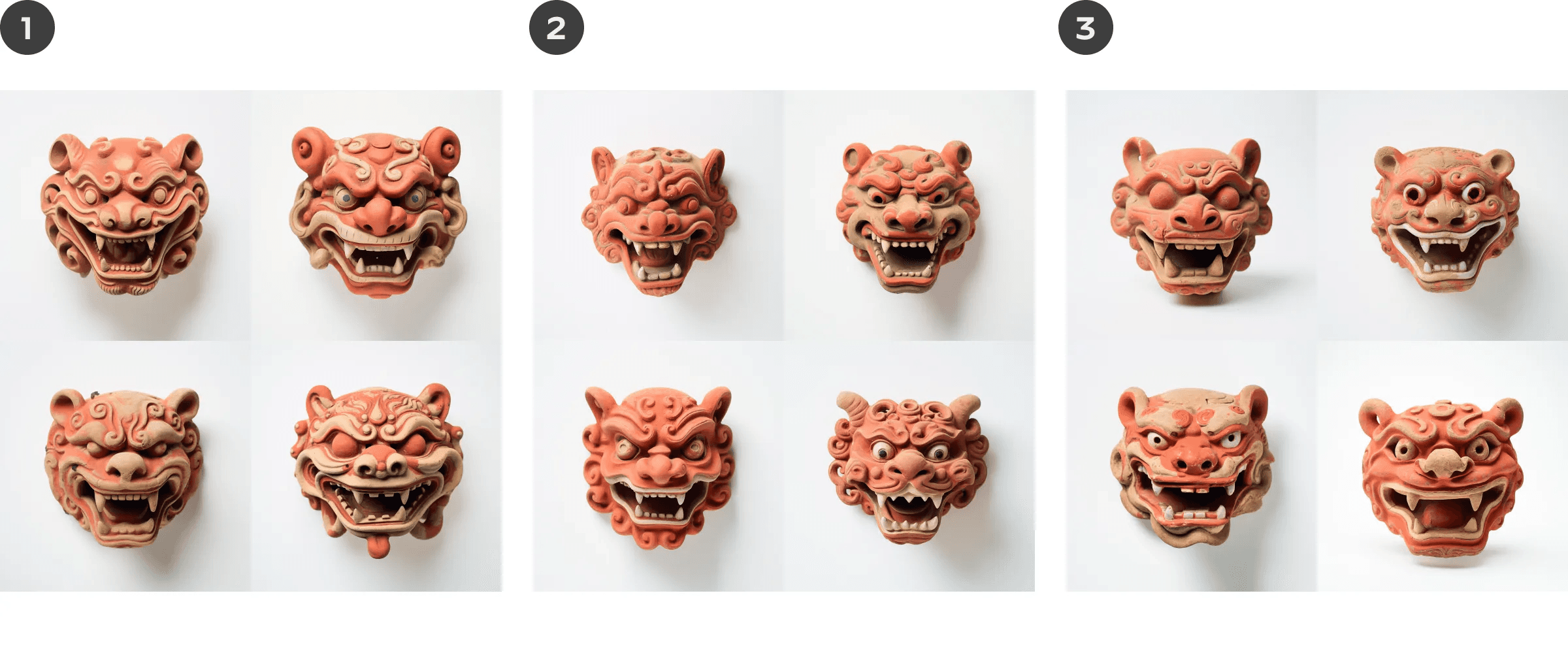
Summary
You can see below that after three rounds of prompts referencing the previous image, we can quickly get something entirely different from the source.
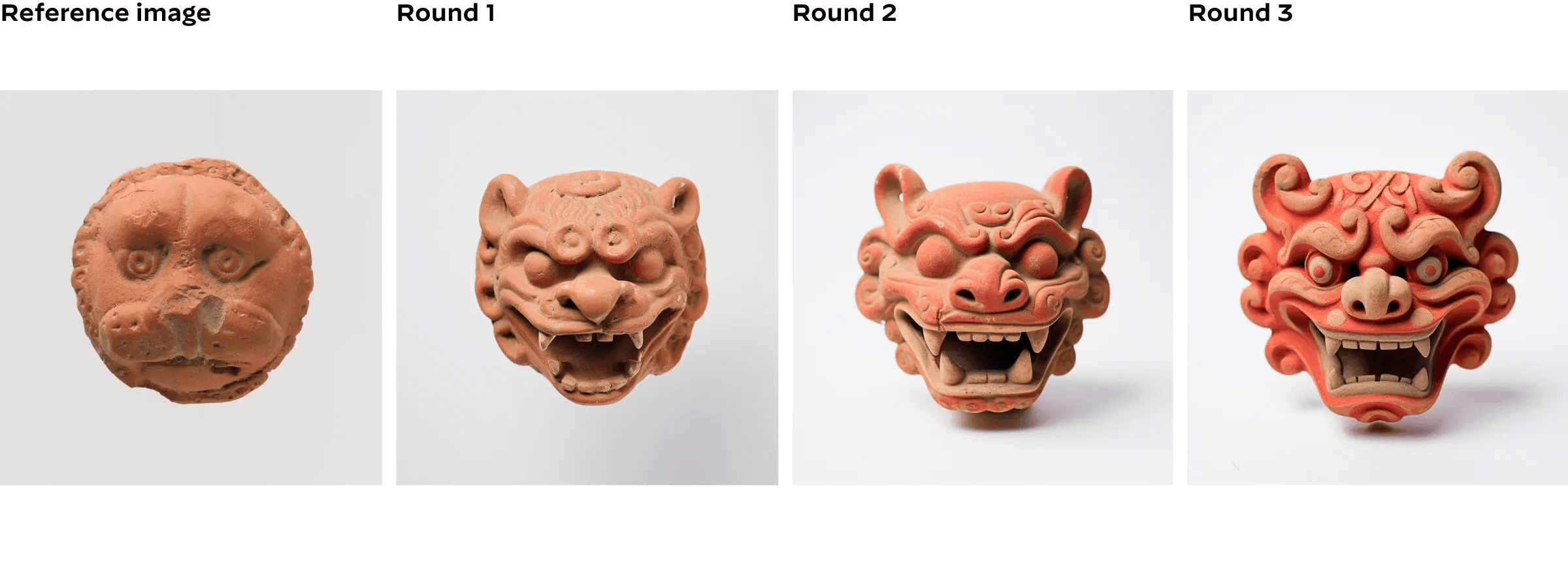
We can also see that the level of stylization and detail increases with each image. Which of the photos do you prefer? Depending on the project, you may want more or less detail, and now you understand how to achieve that.
Image reference example 2
Let’s look at how combining an image reference with another idea can create something new from both. I’m using an image I took while in China for this one. The more significant the difference between the imagery and the prompt you use, the more novel the result will be.
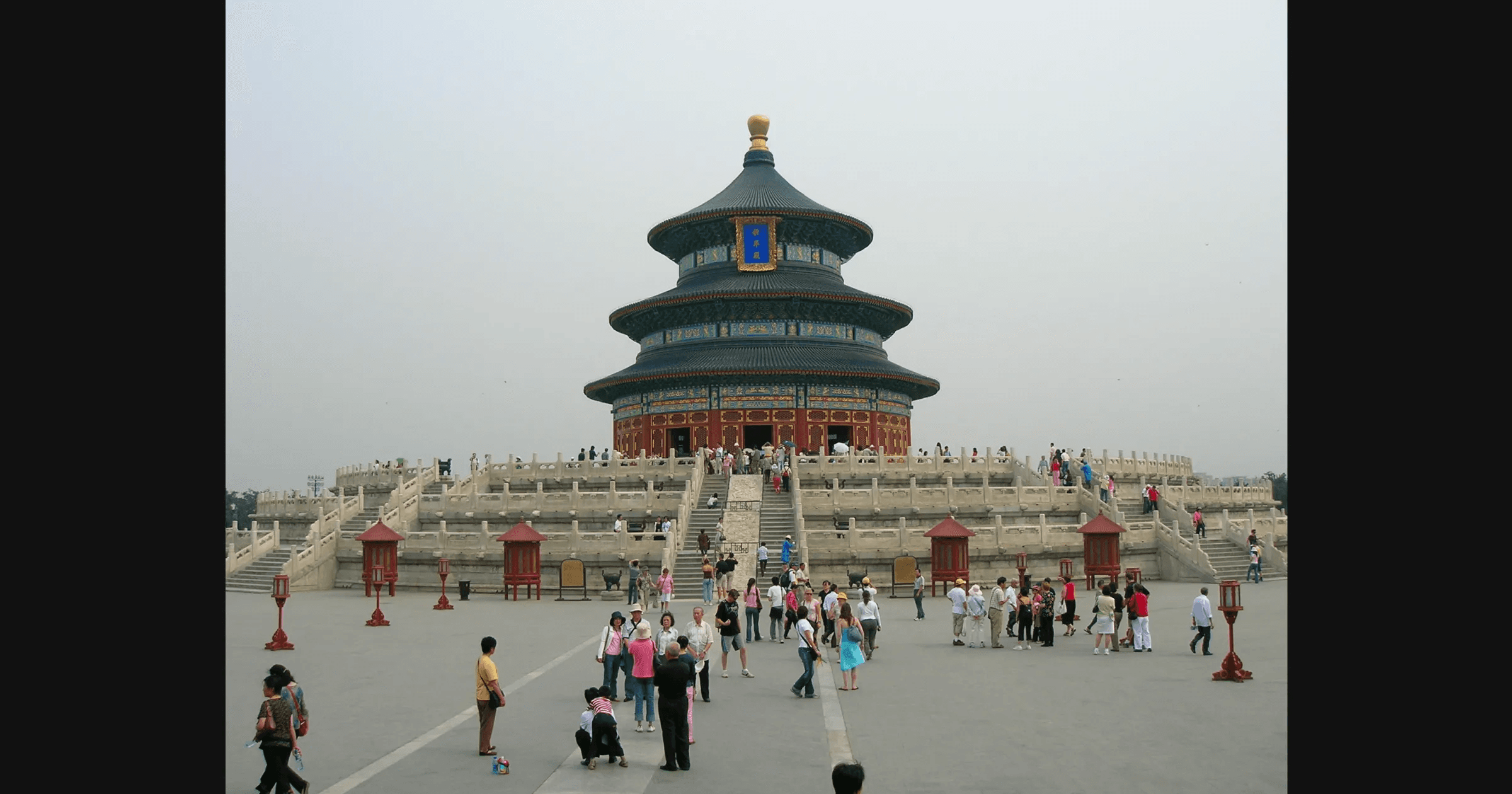
Image reference round 1 prompts
*Prompt differences in bold text.
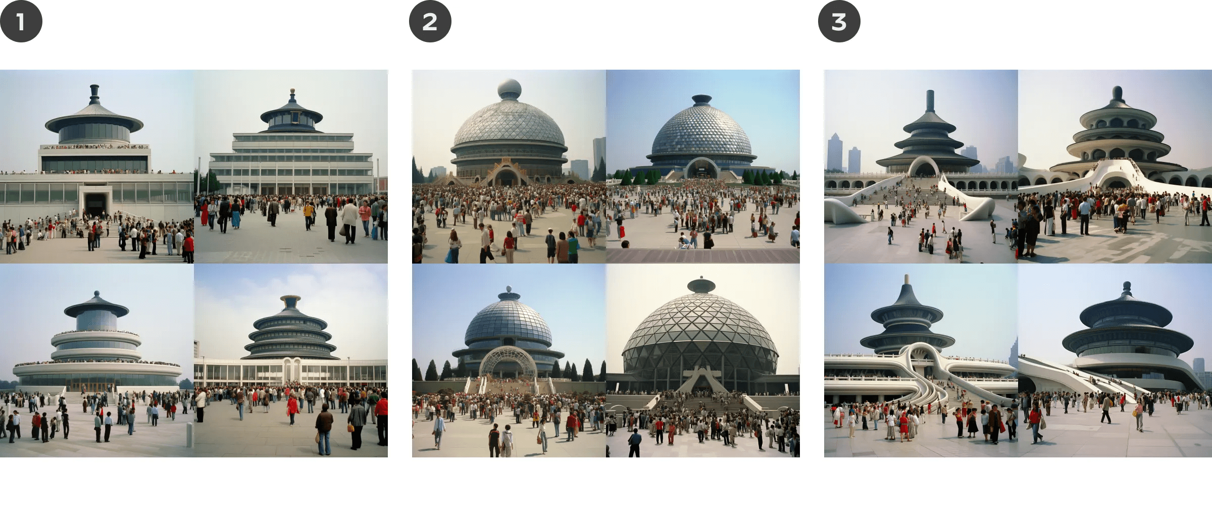
[source image link], modern building designed by Dieter Rams, people surround, 1980s photo
[source image link] modern building designed by Buckminster Fuller, people surround, 1980s photo
[source image link] modern building designed by Zaha Hadid, people surround, 1980s photo
Image reference round 1 results
Prompt result without image reference
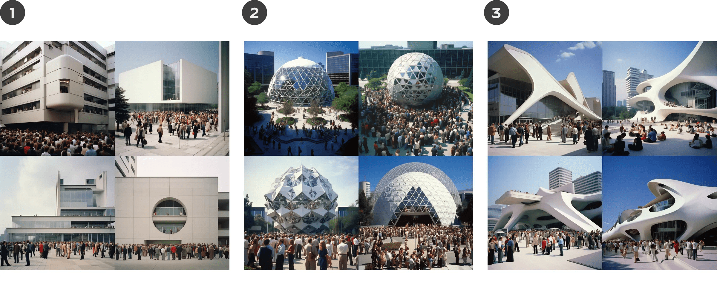
Image reference round 2 prompts with color instructions
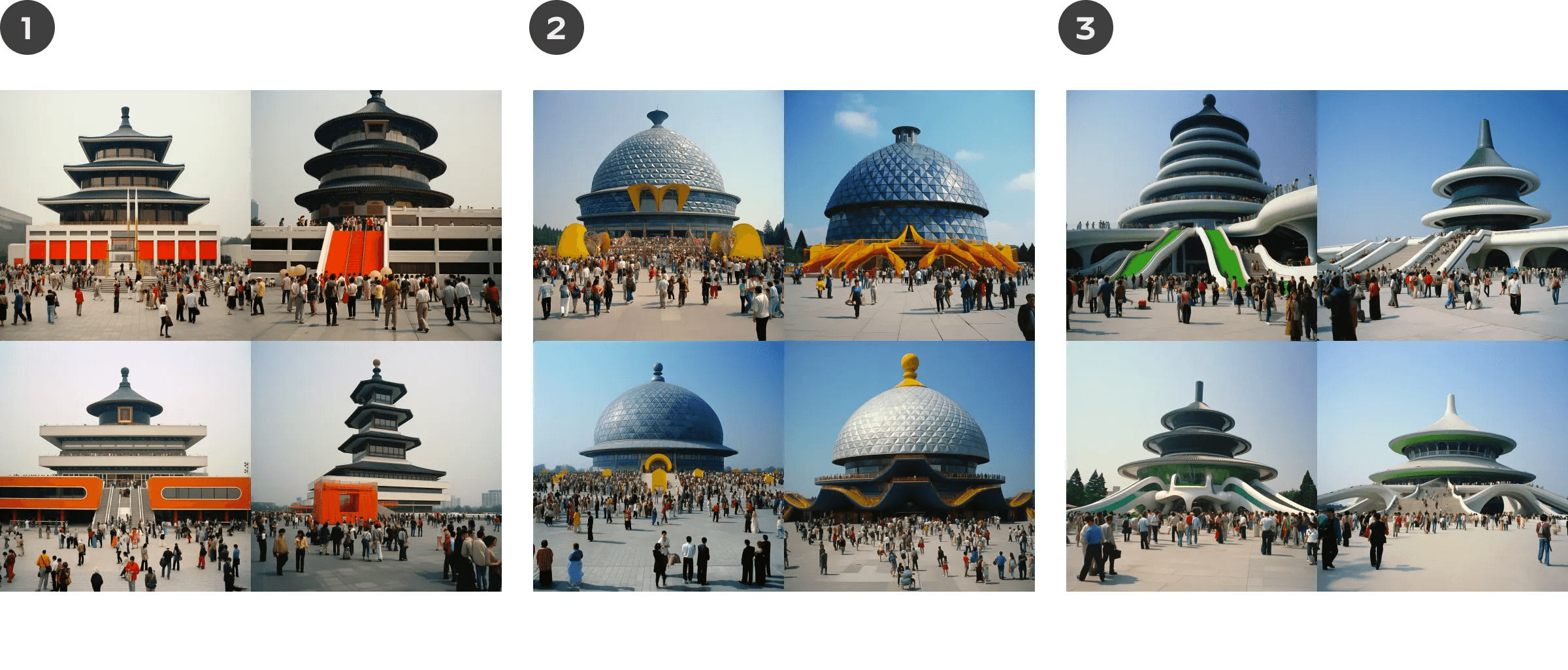
Let’s repeat the same prompt and reference image but add colors to our prompt this time.
*Prompt differences in bold text.
[source image link], modern building designed by Dieter Rams, black, orange, and white, people surround, 1980s photo
[source image link] modern building designed by Buckminster Fuller, blue and yellow, people surround, 1980s photo
[source image link] modern building designed by Zaha Hadid, green, blue, and white, people surround, 1980s photo
Image reference round 2 with color instructions results
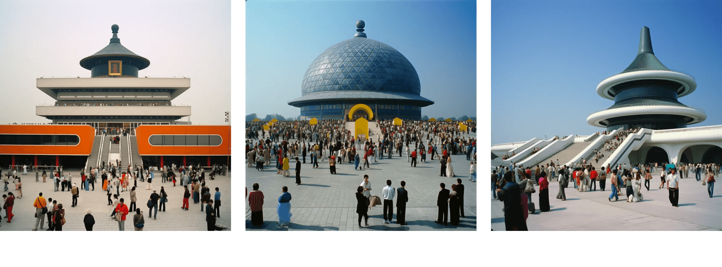
Here are my favorites.
How to use Parameters
Parameters help you alter things like aspect ratio, level of stylization, and even how unusual your results are. There are lots of different parameters you can use. I’ll share the ones I use the most below. If you want to see more examples, click here.

Parameter: --aspect ratio
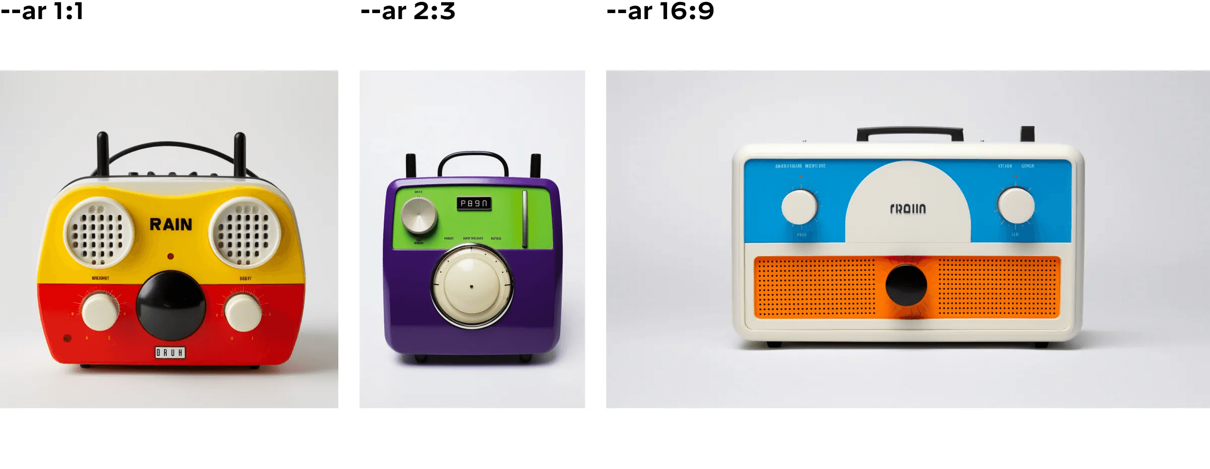
The --aspect or --ar parameter changes the aspect ratio of the generated image. An aspect ratio is the width-to-height ratio of an image. It is typically expressed as two numbers separated by a colon, such as 7:4 or 4:3”
— Midjourney Quick Start Guide
--aspect ratio prompt examples
*Prompt differences in bold text.
braun radio with a face, red, white, yellow, black, natural light, plain white background, 1960s photo, --ar 1:1
braun radio with a face, purple, green, white, black, natural light, plain white background, 1960s photo, --ar 2:3
braun radio with a face, blue, orange, white, black, natural light, plain white background, 1960s photo, --ar 16:9
Parameter: --stylize
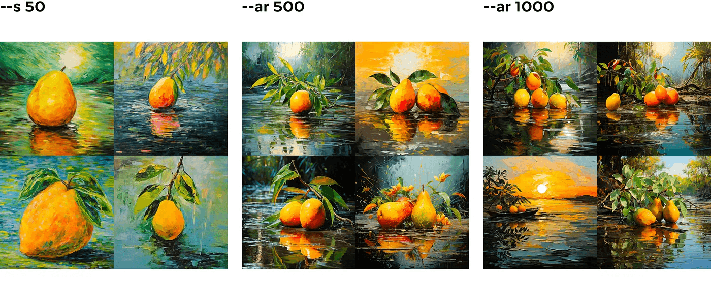
The --stylize or --s parameter influences how strongly this training is applied… High stylization values create images that are very artistic but less connected to the prompt.
You can change the stylization level from 0 to 1000. Here is an example of what that looks like with the same prompt.
--stylize prompt examples
*Prompt differences in bold text.
painting of mango in the style of Claude Monet --s 50
painting of mango in the style of Claude Monet --s 500
painting of mango in the style of Claude Monet --s 1000
Parameter: --no
The No parameter tells the Midjourney Bot what not to include in your image. — Midjourney Quick Start Guide
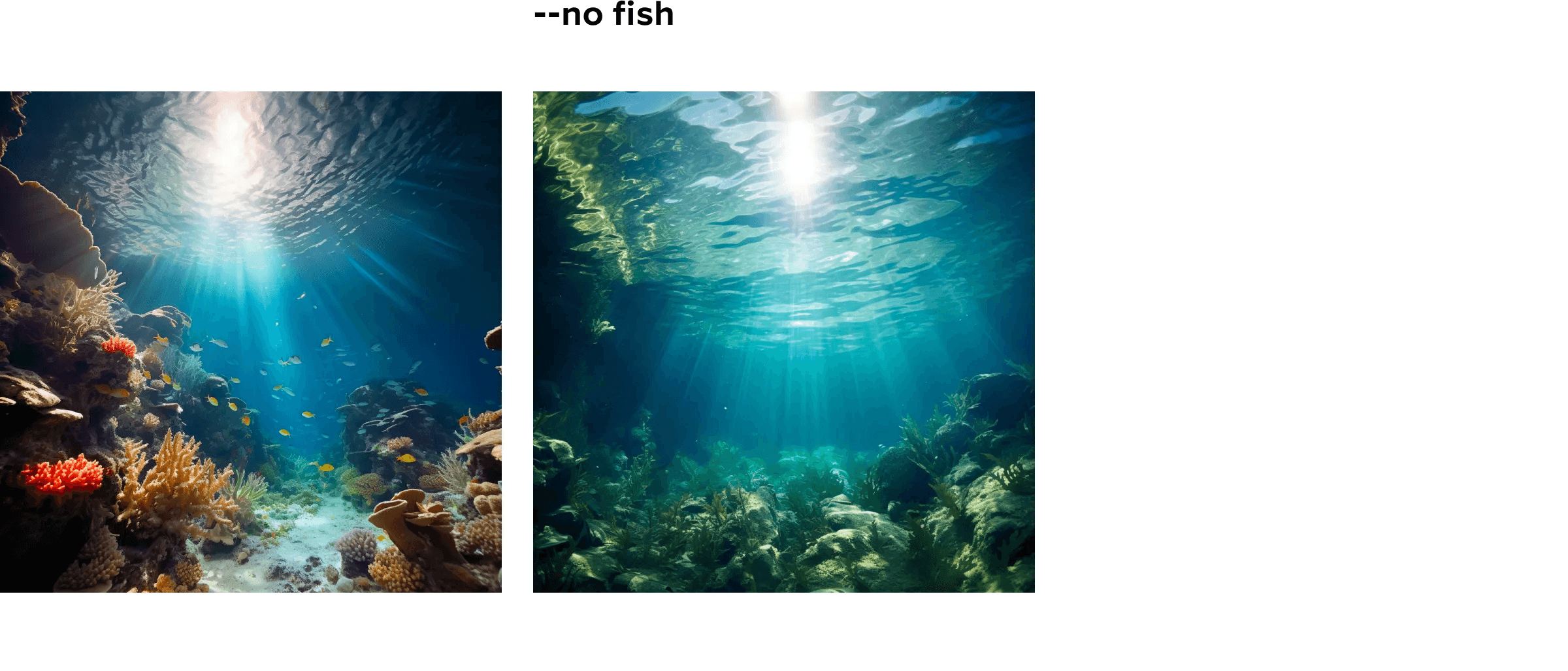
Negative prompting in AI rarely works, in my experience. In the example below, only one of the four images generated removed the fish (so I included that one below), but it also removed all the coral reefs. Because AI associates and pairs certain subjects together, getting one without the other can be challenging.
--no prompt examples
*Prompt differences in bold text.
underwater ocean, photo
underwater ocean, photo --no fish
Parameter: --tile
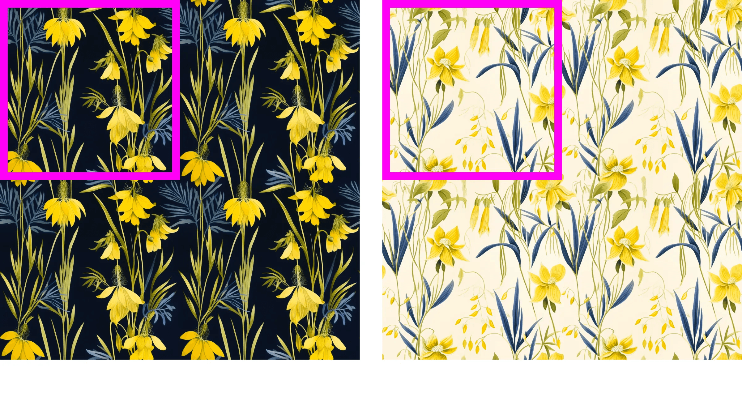
The --tile parameter generates images that can be used as repeating tiles to create seamless patterns for fabrics, wallpapers, and textures. — Midjourney Quick Start Guide
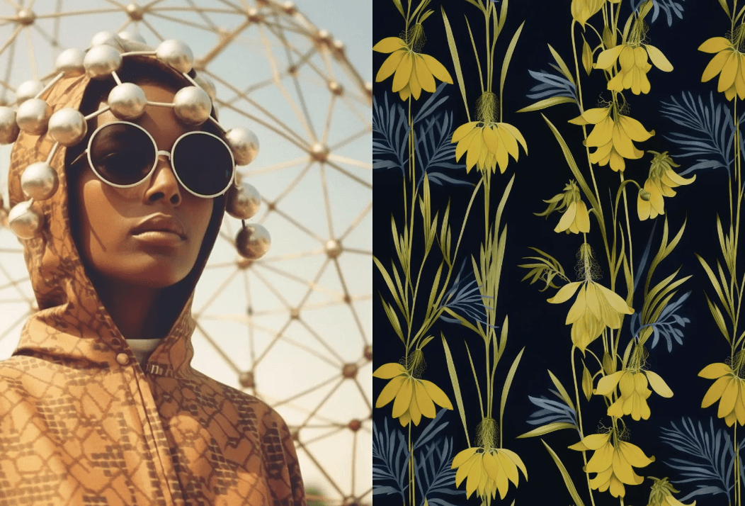
The --tile parameter is a great way to quickly create seamless patterns. These could be used for packaging, brand identities, or applications.
--tile prompt example
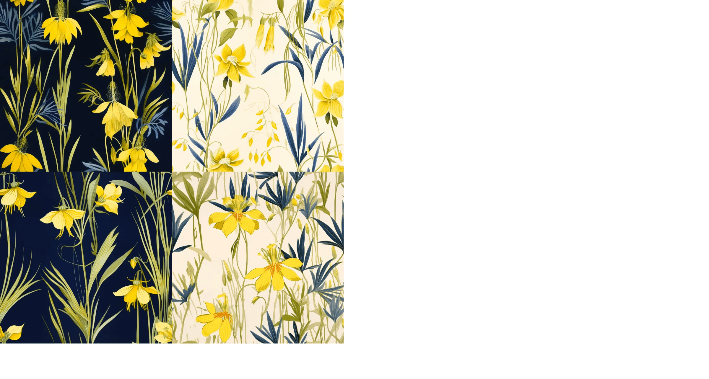
I included a public-domain reference image in this prompt and added some text to describe the colors and texture I wanted.
*Prompt differences in bold text.
https://s.mj.run/GR7wTBLF1Tk botanical plant, blue, yellow, papyrus --tiled
--tile prompt example results
How to use Blend
The /blend command is a great way to combine similar or disparate ideas and visuals to create something new. Let’s try it out by blending free stock photography and public domain images.

The /blend command allows you to upload 2–5 images quickly and then looks at the concepts and aesthetics of each image and merges them into a novel new image.
— Midjourney Quick Start Guide
Blend example 1
What if we combined two very different architectural styles?
Blend example 2
What if we created a collage?
Blend example 3
What if we combined two different kinds of vehicles?
A few parting thoughts
Once you start playing with generative AI, you lose track of time exploring every what-if that comes to mind. While there are limits to what it can do, AI is getting better all the time, and eventually, the only limits will be what you can imagine.
What is Generative AI useful for as a designer?
Visualizing concepts
Mood boards
Storyboards and style frames
Creating seamless patterns
Generating images for use in collage and illustration
What are the current limitations and problems with AI?
Here are some things I’ve noticed in Midjourney, and I wouldn’t be surprised to find similar issues in other AI tools. I don’t have answers on how to fix these problems, just questions.
Algorithmic bias
If you type in “businessman” or “person driving,” it automatically defaults to a white person. If you say “person from…” and name a country, you can get around that. What other ways might it be biased? What can be done to fix problems like this?
See examples and their prompt text below. Even when writing “from America,” all the resulting people are white.
Using art without consent
Many generative AI tools have been trained with content and visuals that the company does not own or have rights to, including Midjourney. Are there ethical ways to use these tools as a designer? If so, what does that look like?
Technical limitations
Generative AI still has many glitches and unintended results: trouble with hands, disturbing results, and difficulty with group scenes. People end up with three legs or the wrong amount of fingers. These problems are slowly being fixed and improved over time.
An example of the type of glitch it sometimes generates is below.
Prompt text: Man standing in rain with umbrella, medium shot, vintage 1960s photo
Generative AI can be extremely helpful in visualizing ideas and writing copy. But for now, it’s most useful as a jumping-off point, not a finished product.
No doubt, regulation, accountability, and safeguards are needed. We’ll have to wait and see what forms those take.
In the long term, I hope AI will enhance artists’ ability to create, not replace them. While it may be able to generate imagery at an alarming speed, the quality still largely depends on the taste and thoughtfulness of the human behind it.
If you’d like to follow my explorations in generative AI, click here.
Sam is a graphic designer, brand strategist, and wordsmith based in Utah. Before relocating to the West, he worked for Doyle Partners in NYC. He is currently employed by Bridger.